A (Brand) New Look

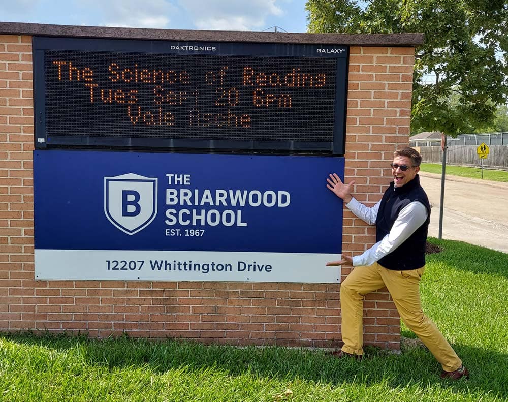
As part of honoring the past and looking toward the future of Briarwood this year, many of you have prob- ably noticed that we have an updated brand!
We are very excited to “roll out” the finished product and integrate the new cohesive brand into more aspects of student, faculty, and parent life both on and off campus. As we continue with the brand implementation, I thought it important to walk through how we got here.
This was a surprisingly arduous, yet enlightening, process. The first step was finding the right professional partner, and we found that in Primer Grey, a small branding agency based here in Houston, with a 13-year track record of working with small businesses and nonprofits.
Given the history of our school, their approach was to understand our background and all facets of our culture before designing anything. Team members from the administration and the teaching staff of both Briarwood and Tuttle dedicated hours talking through history, perceptions, communication, and forward looking goals.
One of the most important takeaways from this process was the distinction between the two schools and how important they are to each other while also being individual entities. This understanding became a driving force to how Primer Grey approached the brand, while understanding that there is a delicate balance between specific identities and unity as the greater whole. We sought to give each school a more distinct identity, while maintaining a consistent look for Briarwood as a whole.
You’ll notice that the “old” school colors carried over. But instead of using blue and red to represent both schools, they were “split up” to give each school their own identity. Blue for Briarwood and red for Tuttle to promote that idea of unity and cohesion.
Our mascot, the beloved mustang, was also updated to feel bolder and distinctive from other area schools using the same style mascot. Crests were incorporated into the brand to feel more academic, taking inspiration from lo- gos of prestigious universities. The end result was a mix of classic academic motifs and modern elements. A perfect representation of leaning into the past to move into a bright and prosperous future. We hope you’ll agree!
